Logo
Yes, it took half a year for me to finally get around to it, I admit, but I have finally finished the logo for my mother’s blog, KaSaInteriors. I primarily procrastinated because I wasn’t perfectly happy with what we had planned out… it was a cool idea, sure, but you know, eh. The triangle of the roof and the circle of the globe simply didn’t seem to match up for me.
Brief:
- Interior design company (hence the roof)
- Tagline: “Out of the Country, Out of the Box”
- Global firm – must represent that
- Colours: blue for reliability? Must also be artsy


Above you can see a couple of concept sketches (my mom actually has a considerably nicer set of concepts that she did for the original logo, but I can’t find her sketchbook at the moment, hence the post-it). The second, pink post-it was done earlier this morning while at breakfast. I had screwed up with a post on KaSaInteriors the night before, and my mom was guilt tripping me something awful for only botching things and never accomplishing what I promised. Oops. This logo was then the ultimate trump card. Somewhat spiteful, I began to sketch out designs, trying to find a more sophisticated balance between the circle and the triangle of the roof.
It struck me at some point that I could turn it into a “K”, for KaSaInteriors. Awesome. Also note the beautiful renderings of the continents. They look like real blobs of nothing in particular. I also preferred it for another reason: the fact that the globe was not constrained to huddling beneath the roof like it was scared of coming out represented the KaSaInteriors motto, “Out of the Country, Out of the Box” considerably better, in my opinion.
In any case, as I am wont to, I opened photoshop, and began transferring it to a digital format.
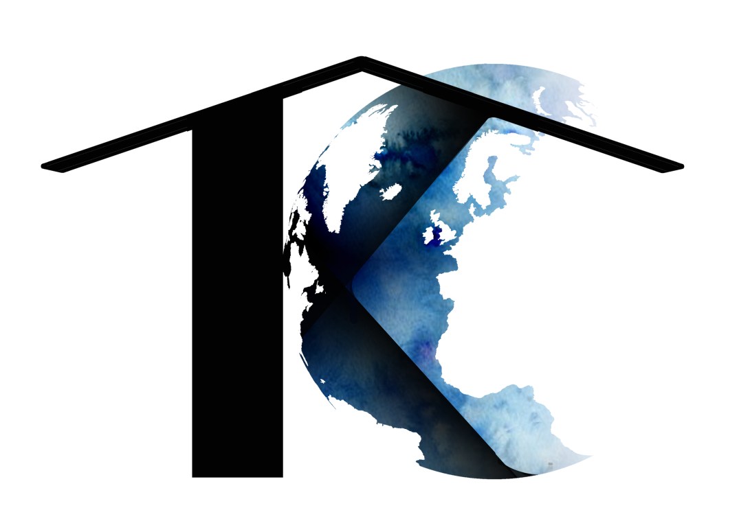
This is the icon logo I came up with. Lots of rounded corners that caused me some pain, but it was quite worth it in the end. I also got rid of the chimney on my mom’s bidding: it would look more minimalistic if it weren’t there. In order to represent the artsy aspect of our family/my mom’s company (does it count as a company yet?) I gave the globe a subtle watercolour texture.
Being now free to do whatever I liked, I added the text and tagline. I have been waiting for an opportunity to use that font for so long you have no idea.


In any case, here’s the final logo (: You can see it in all its glory on KaSaInteriors (shameless advertising, I know).
Stationery
But what’s a logo to do without anything to put it on? So I made up a business card (note: this is all for one of my mom’s assignments, so there was a list of things to do) to match.


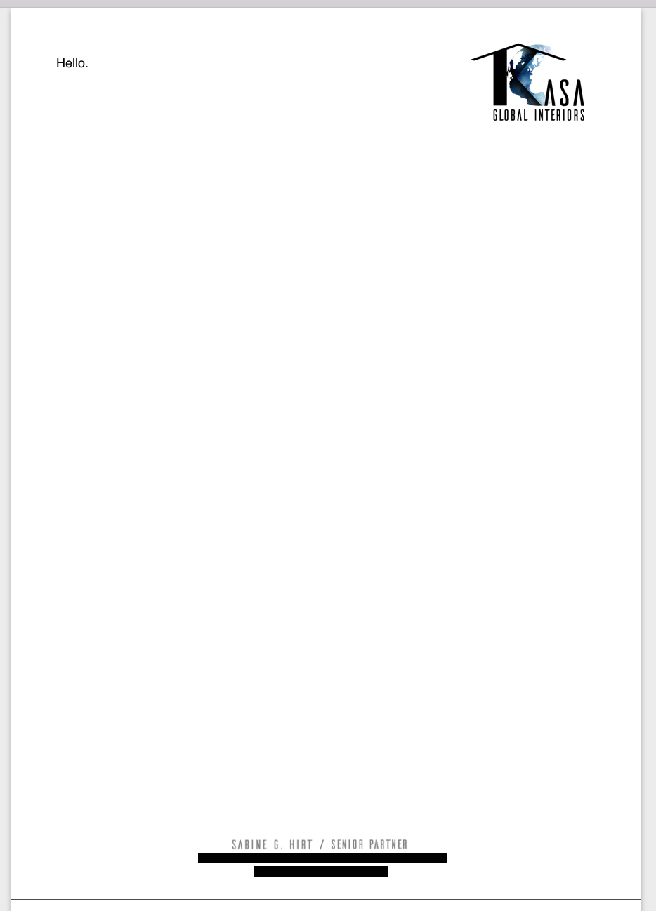
The last thing I did was whip up a letterhead, but, aside from the learning experience I got out of making it (I didn’t actually know what a letterhead was before I started, let alone what kind of information to put in it, and don’t even get me started on Microsoft Word templates! I didn’t know you could make your own!).
And that’s all, folks!