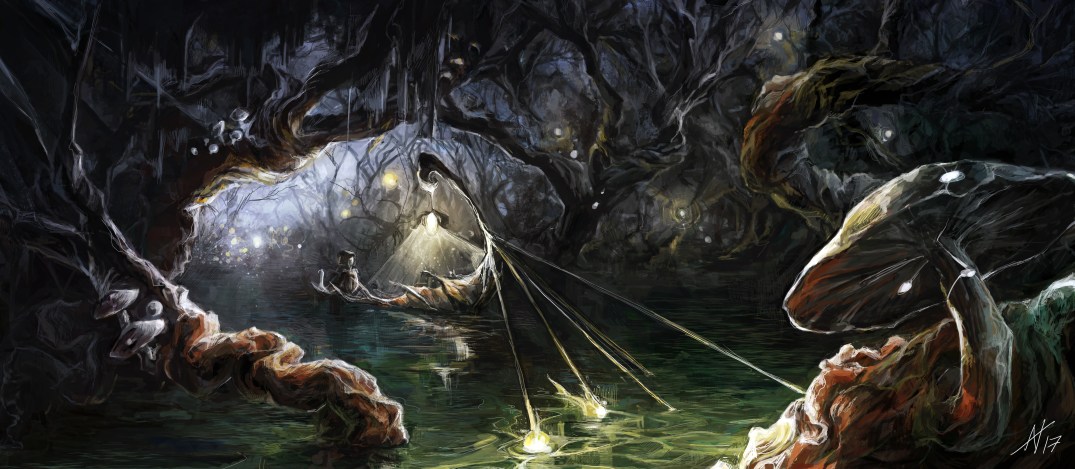
I… don’t like doing environment sketches. At all. Mostly because I’m really not very good at them.
So in order to challenge myself, I did an environment sketch (thank you so much Deanna for the inspiration!)
I… don’t like doing environment sketches. At all. Mostly because I’m really not very good at them.
So in order to challenge myself, I did an environment sketch (thank you so much Deanna for the inspiration!)
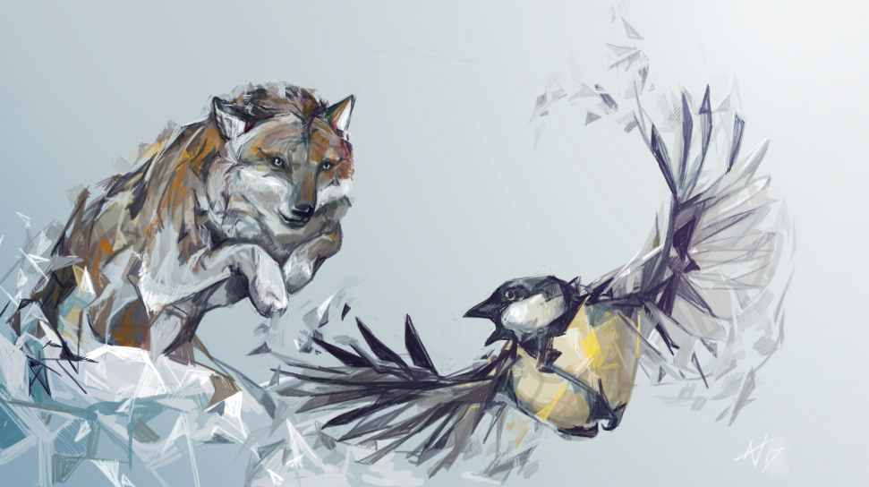
Quickie sketch for a friend 🙂
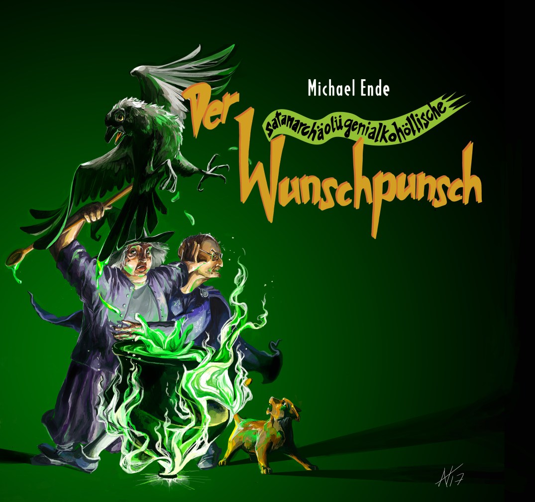
This painting was inspired by the love I bear my sister. To acknowledge her efforts in reading the German books my mother asks her to (and make it more fun!), I began making small illustrations for each book she read.
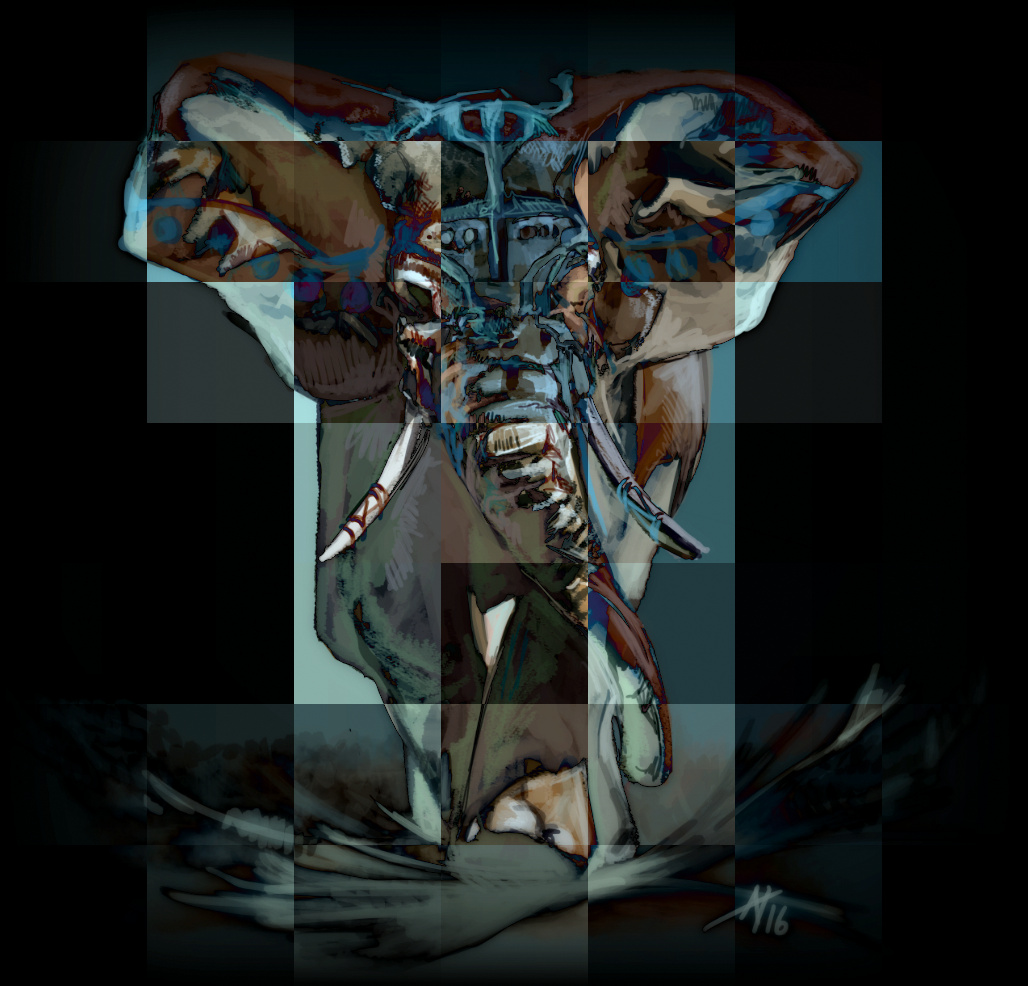
The drawing began as a pencil sketch; after numerous thumbnails, I settled on a composition I liked for the following reasons:

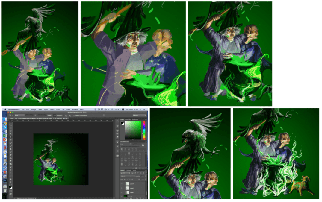
Sensing that I wanted to spend more time on this drawing than I typically do on a digital piece, I approached it in a modular fashion, adding detail from region to region and exploring how I could bring contrast and character into my painting one step at a time. The fact that with every added detail the mood of the painting changed made this immensely exciting, and I really enjoyed unearthing what I came to see as its spirit.
My sister’s knowledge of the story also shaped the piece, something I found profoundly interesting. I must admit: I was not familiar with the source book of the illustration. I love the author, but for synopsis and a general idea of what was going on in the plot I relied heavily on online summaries and looked quite carefully at existing illustrations, especially those in the book itself. Nevertheless, I was drawing on shaky foundations, and it was my sister who filled in the gaps for me. For example, as I believed that a witch’s cat should be black, the cat was initially black. My sister corrected me, however, as well as insisting on small details such as the ruby ring worn by the male wizard, and through this collaboration I believe we created a piece that truly represents the story it is based on.
Chiara (my youngest sister) is in midst of an arduous journey to improve her German, a monumental (just kidding, her technical knowledge of German grammar is by now considerably better than mine, and her speaking ability practically fluent) task which necessitates reading many German books — not her favourite activity.
Recently she began reading a book I really loved as a child, Ronja Räubertochter, and to show Chiara that I hugely respect the effort she puts into her work and art my way through the week, I decided to make her a bookmark.
Hopefully, more will follow!
Ronja Räubertochter (Ronja The Robber’s Daughter)
The bookmark is done in a more static style, as I tested my abilities to ink neatly digitally. I was inspired by stained glass windows, and, if you zoom in on the picture, the texture ought to reveal itself.
I made one “mistake”, and that was painting Birk’s hair white-blonde, the way both Chiara and I imagined it to be. As she neared the end, she suddenly came across a description in which his hair was copper-red. Whoops. Therefore, two variants now exist. I think I still like the blonde one better!


Slowly but surely getting the hang of my tablet again…
I’m especially feeling more confident about the colours and the clarity of the lines.
So I recently resurrected my tablet (turns out I had the wrong driver software installed, whoops. That certainly explains a lot), and consequently have had to begin reteaching myself how to draw digitally. One of the difficulties, I find, certainly when compared to traditional media, is creating convincing textures giving it sufficient detail without losing a sense of the mass of a subject. Which is pretty much all of art. Lots to learn!
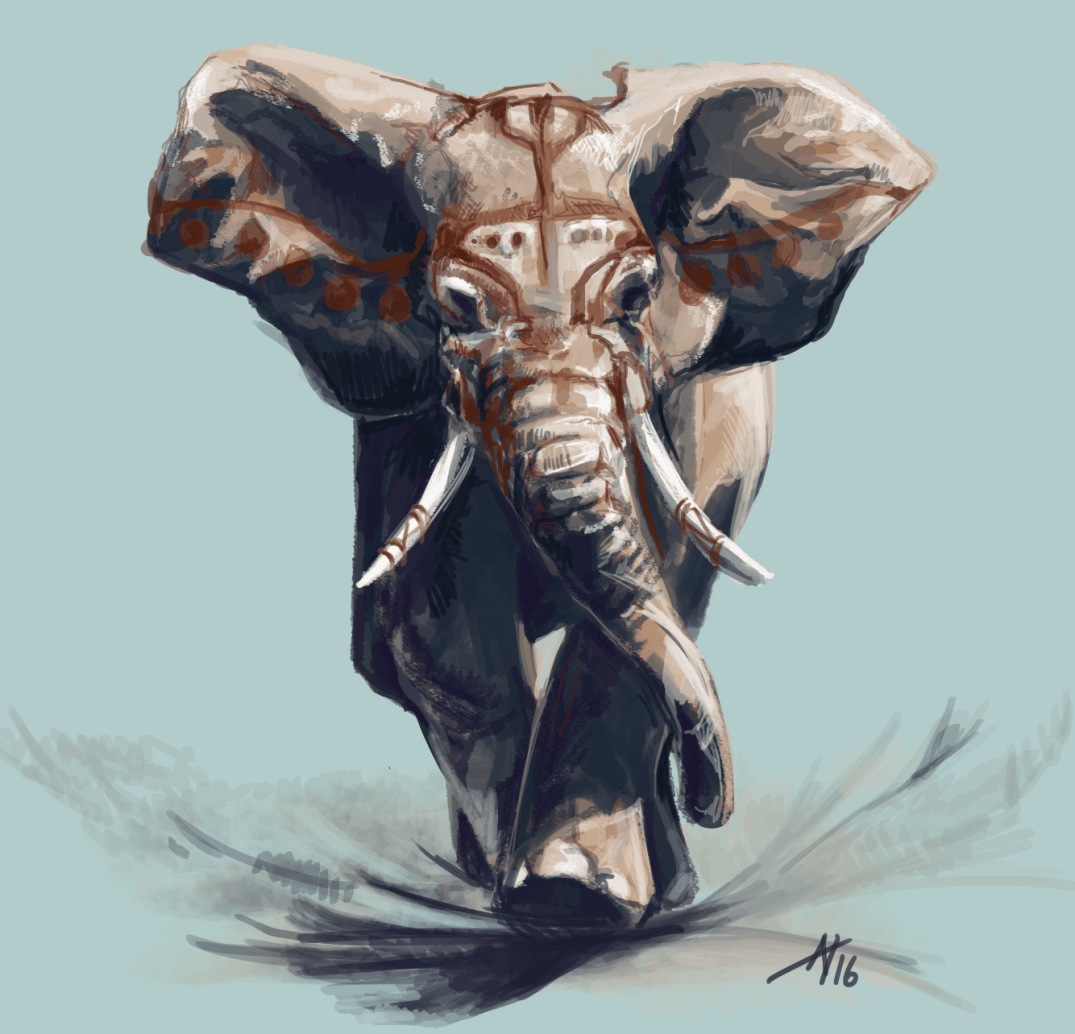
A relatively short piece, maybe one to two hours.
(The war paint on the elephant was inspired to some extent by this piece of art. I can only aspire…)
One of the nice things about digital art is how easily one can manipulate it:
Just kidding, it’s a kingfisher. 40″ by 40″ (a good meter squared), acrylic.
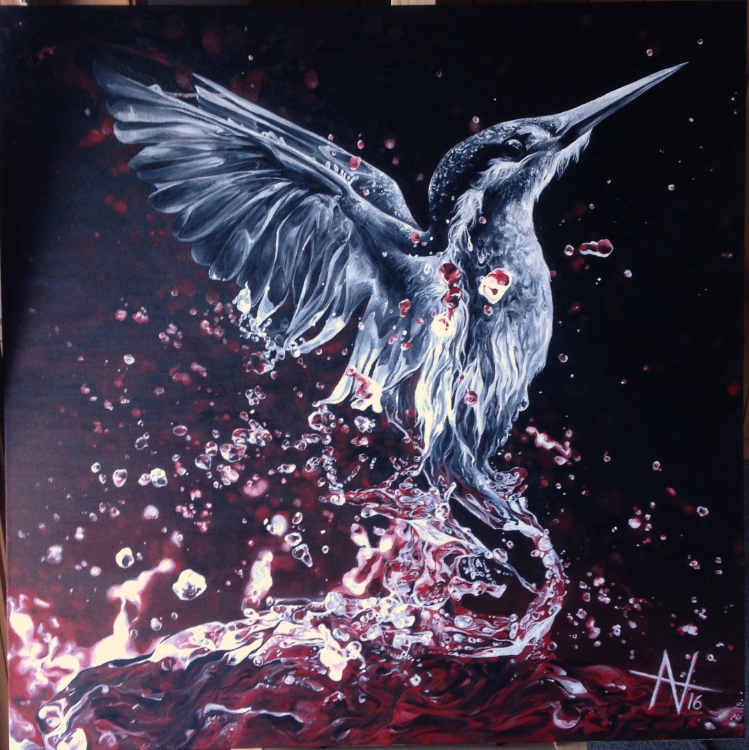
I started work on Phoenix (which at that time was under the working title of Heledir, or literally “kingfisher” in Tolkien’s Sindarin language) last summer — it was the first time anyone had trusted me with a canvas as big as this, and I spent hours thinking about what exactly I would paint. In the end, I settled for this: a kingfisher soaring out of water, the kingfisher being my father’s favourite bird, and this being intended as a present for his 50th birthday.
As it turned out, I was not finished in time for his 50th. But I did make his 51st!
I failed to take progress pictures last year, so they start from this year. It took quite literally weeks to finish it off, during which time I churned through three different audiobooks and at the end of which I was positively sick of bubbles of water. Anyhow, it’s done! Finally! And I have a new signature, which I think I’ll stick with (:
I’m supposed to wait with posting this until after the exams have been graded, but I’m simply going to assume that two weeks before grades are distributed and two and a half months after taking the exam that I’ve got my art grade and, well, posting it won’t make too much of a difference, hopefully!
My sketchbooks will be out soon (also, hopefully — I need to get back home first!) and you can follow the convoluted thought process behind this piece there… I’ll focus more on the actual construction of it here.
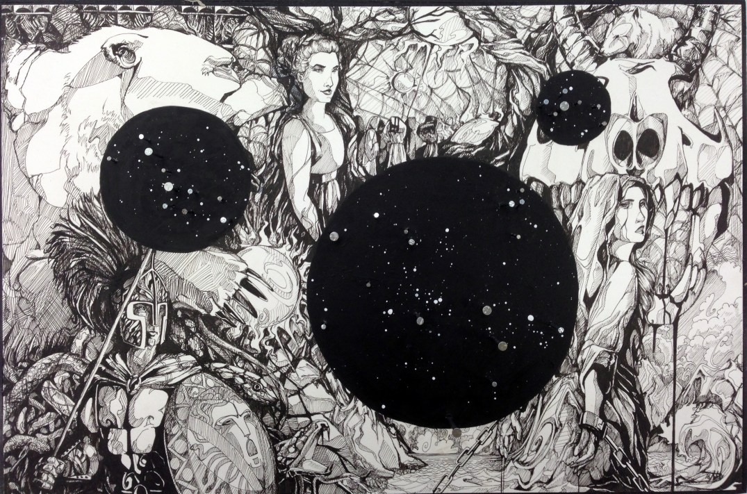
We had ten hours to complete the piece, and I personally had a lightbox, a piece of paper, and a lot of pens (most of which I went through). I started off with a pencil sketch that I had prepared earlier, which I laid underneath the piece of clean paper (which an older student had left over gave to me after finishing off his own project, part of his IB… absolutely beautiful work) in order that I might start drawing.

The composition of it is based around three constellations, each of which is represented in one of the black circles: Perseus, Ursa Minor, and Ursa Major. In order to match them, I drew scenes from each myth (thankfully, there are only really two myths, since Ursa Major and Minor relate to one another) into the background, with an emphasis on the story of Perseus and Andromeda.
Ursa Major only really features as the bear holding the star-like object in the upper left corner. The other figures are Perseus (the warrior, holding a the shield Athena gave him in order to defeat Medusa; carrying on the Medusa theme, there are snakes behind him), Andromeda (tied to the rock while the sea-monster behind her gapes its jaws… not sure how much sustenance a skull could derive from eating her, but hey, artistic license, right?), and Cassiopeia, vain and beautiful in her spite as she surveys the scene from the upper centre. Most of the other devices used are merely placeholders, though the grieving figures beside Cassiopeia could be interpreted as mourning Andromeda’s anticipated death, or the transformation of Callisto into the bear which became Ursa Major (and who was ultimately hunted, unsuccessfully, by her son, who was transformed into Ursa Minor by Zeus before he fired the killing arrow). The wolf between the horns of Andromeda’s beast… was cute. He was meant to be a bear (Ursa Minor) but… yeah the wolf was cute. So he remained.
The illustration itself took a little more than eight hours (we were given ten in total): These pictures were taken in about 2.5 hour intervals.
You could potentially argue that this is where the fun started. Or rather, for my fellow test-takers, the Great Cacophony. In order to attach the strings (I’ll explain why in a second) to my piece, I needed to adhere my illustration to a piece of wood, which would then need to have nails hammered into it to represent the three constellations I had planned. As you’ll notice above, the main stars of the constellations are, in fact, nails. The others I had prepared before by splattering the black circles with white paint.
A number of nails, and grumpy classmates (it was actually great because under test conditions we were forbidden to talk, even the teacher… nonetheless I was glared at and a move into the stairwell was requested. This only aggravated the issue. Whoops). Thankfully I’d already prepared the row of nails I needed on the back of the plank of wood before the exam started… heh!
With about half an hour to go, and everything ready, I began to work on the final step: spanning a net of strings over the illustration. This web, for lack of a better word, has a number of symbolic reasons for being there. First, I spent most of my sketchbook working with string so I had better find a way to incorporate it into my final. Second, it represents a sort of tapestry, the idea that the myths and legends of the past are just that — in the past, inaccessible and shadowy to us now.
Stars and textiles, string, and tapestry, have always seemed oddly intertwined to me. The night sky used to look to me like a delicate embroidery of pearls… (not anymore, really, since a greater knowledge of astronomy might make looking into the sky cooler and more existential-crisis inducing, but does take some of the poetic charm out of it). In Tolkien’s mythology, the stars are woven by Varda, “Queen” of the Valar (gods? Or rather, angels). Anyway.


Hence, I completed my piece on time, with seconds to spare as I tied the final knot. It’s not very large, only about the size of an A3 piece of paper.
Since completing it, I have adopted the style into many of my illustrations (most of the recent pen illustrations were done after the art exam). I think, now, in hindsight, that I would have done a couple of things differently as pertained to the line weights and distributions of dark/light patches… but am on the whole quite happy with it, and proud to have finished off my GCSE with this piece.
