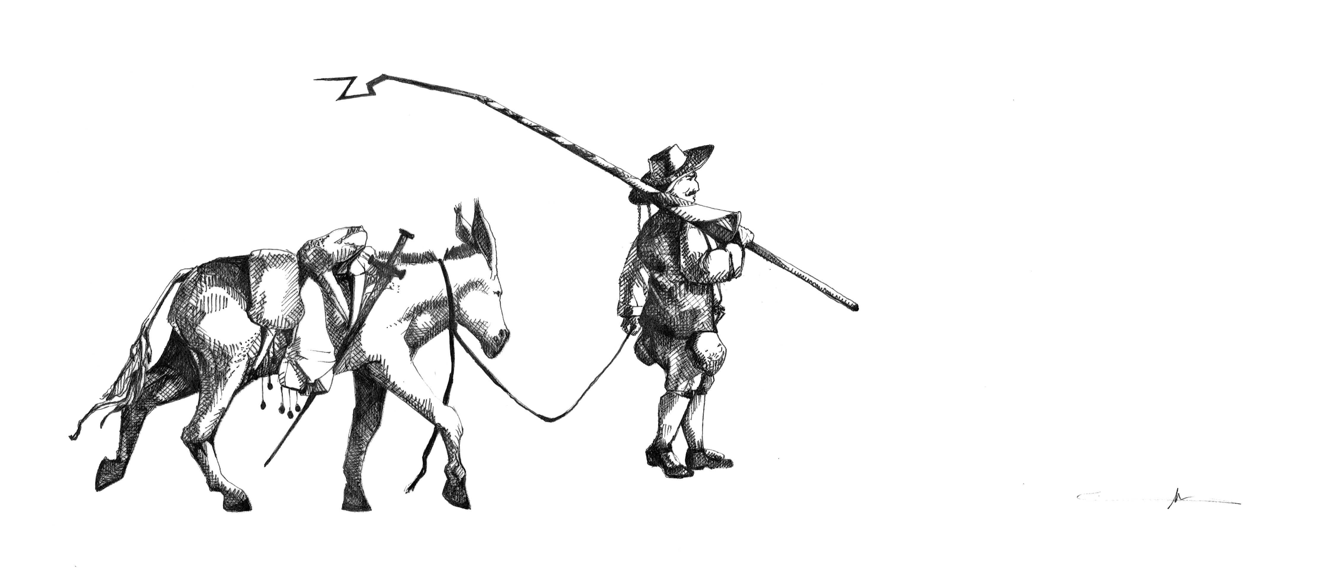
This classic has easily become one of my all time favourites. Boom.
I’ll update with more soon, if I’m still feeling up to it – there are a number of fantastic characters in Don Quixote and I completely recommend that book to anyone and everyone who can stand long stretches of prose. Hm. Perhaps I’ll do some scene sketches. That’ll be the day. Me doing scene sketches. Heh.
Anyway, I… love this book?
Don Quixote, RozinanteDapple, Sancho PanzaDulcinea del Toboso
Yes, it took half a year for me to finally get around to it, I admit, but I have finally finished the logo for my mother’s blog, KaSaInteriors. I primarily procrastinated because I wasn’t perfectly happy with what we had planned out… it was a cool idea, sure, but you know, eh. The triangle of the roof and the circle of the globe simply didn’t seem to match up for me.
Brief:
Interior design company (hence the roof)
Tagline: “Out of the Country, Out of the Box”
Global firm – must represent that
Colours: blue for reliability? Must also be artsy
Original Concept
Early-morning Doodles
Above you can see a couple of concept sketches (my mom actually has a considerably nicer set of concepts that she did for the original logo, but I can’t find her sketchbook at the moment, hence the post-it). The second, pink post-it was done earlier this morning while at breakfast. I had screwed up with a post on KaSaInteriors the night before, and my mom was guilt tripping me something awful for only botching things and never accomplishing what I promised. Oops. This logo was then the ultimate trump card. Somewhat spiteful, I began to sketch out designs, trying to find a more sophisticated balance between the circle and the triangle of the roof.
It struck me at some point that I could turn it into a “K”, for KaSaInteriors. Awesome. Also note the beautiful renderings of the continents. They look like real blobs of nothing in particular. I also preferred it for another reason: the fact that the globe was not constrained to huddling beneath the roof like it was scared of coming out represented the KaSaInteriors motto, “Out of the Country, Out of the Box” considerably better, in my opinion.
In any case, as I am wont to, I opened photoshop, and began transferring it to a digital format.
Final Icon Logo
This is the icon logo I came up with. Lots of rounded corners that caused me some pain, but it was quite worth it in the end. I also got rid of the chimney on my mom’s bidding: it would look more minimalistic if it weren’t there. In order to represent the artsy aspect of our family/my mom’s company (does it count as a company yet?) I gave the globe a subtle watercolour texture.
Being now free to do whatever I liked, I added the text and tagline. I have been waiting for an opportunity to use that font for so long you have no idea.
Logo with Text
In any case, here’s the final logo (: You can see it in all its glory on KaSaInteriors (shameless advertising, I know).
Stationery
But what’s a logo to do without anything to put it on? So I made up a business card (note: this is all for one of my mom’s assignments, so there was a list of things to do) to match.
Front
Back
The last thing I did was whip up a letterhead, but, aside from the learning experience I got out of making it (I didn’t actually know what a letterhead was before I started, let alone what kind of information to put in it, and don’t even get me started on Microsoft Word templates! I didn’t know you could make your own!).
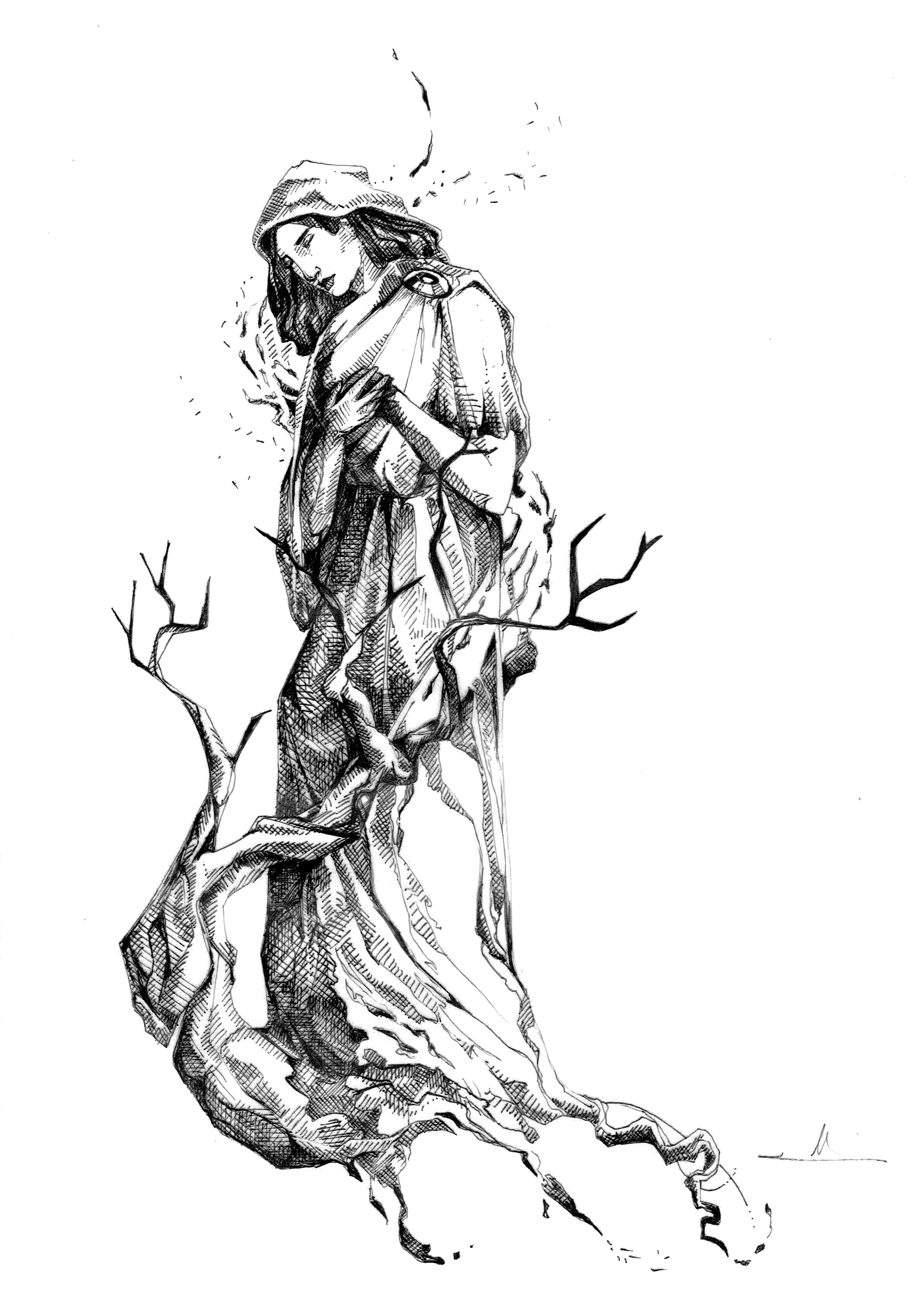
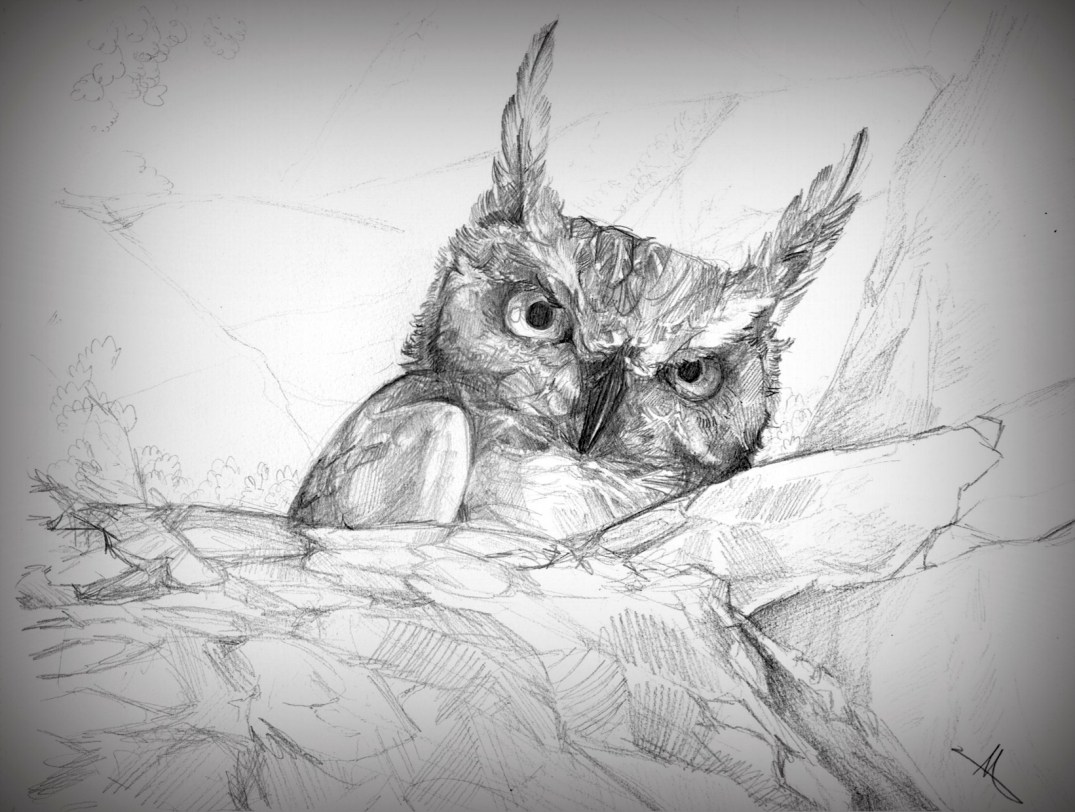
Given that she had just had a near-death experience flying into a chaotic tangle of twigs on our account, this desert owl has every right to look a bit grumpy…
I intended to draw a lot more while in Africa, but I leaned more towards photography. Nonetheless, I found time (while in an awfully bumpy jeep) to make two quick sketches of the wildlife.
Since my sketchbooks are currently being graded by the IGCSE exam board I’m not technically allowed to put any of my work up anywhere yet, but just to assure you that this isn’t a random void in the middle of our portfolio (oops. It’s like a black hole at the moment), here’s a quick preview.
Very revealing, I know 🙂
So this is pretty much how it’s going to work: since no one (not even I. I tried.) can read my writing, I’m going to make a video for each sketchbook (I might actually break it down into units rather than sketchbooks, which would make more sense. It would also be more palatable), in which I’ll try to explain what I was thinking at the time.
These videos will come as an abridged and an unabridged version (abridged first), and for the former I’ll try to limit myself to three or so minutes, probably just enough to flip through the book and give an overview of it. I don’t know how long the unabridged ones will get, but given the size of the books and my tendency to talk off at tangents when discussing my art, it might be formidable.
(If there ends up being no unabridged version, that just means that I severely overestimated my capacity for talking about my sketchbooks, and three minutes turned out to be ample time. I’m just a bit skeptical about that at the moment.)
Sketchbook I, Opposites
^ I also have pictures of one of my sketchbooks. If anyone would like me to upload those in addition to the videos, I’ll take pictures of the other two and put them up as well (:
No celebration is complete without food, and no food is truly enjoyable without having a menu beside you listing all the wonderful courses you still have ahead of you. My parents’ fiftieth birthday party was no exception, and I ended up making them a hand-drawn (how hand-drawn is a digital piece, exactly?) menu.
I do hope that it was received as well as the food was!
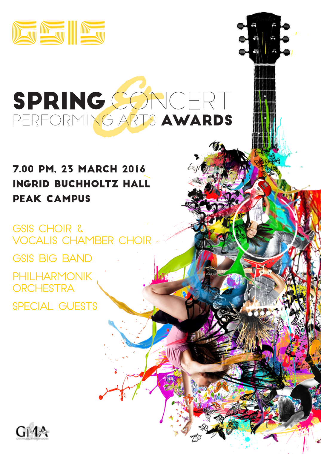
As a member of and PR officer for the GMA (GSIS Music Ambassadors), it is my honour to present you with the fruits of my torture: a number of posters for school events. Exciting! A disclaimer: though I do take credit for having done the bulk of work, I have a number of excellent mentors (cheers, school PR department!) and friends who gave me advice and suggestions as to how to improve the designs.
First, the drafts: my brief for the Christmas Gala Concert was something along the lines of “it should be impressive! Minimalist! Mature! Inspiring!” Hm. Baubles and aesthetic, here we come. For the Spring Concert, I was told to use a guitar graphic that has come to be used as a sort of second logo for the GMA.
The first was too minimalist, the second not minimalist enough (I sound like I’m complaining but really I’m not – making these posters is really fun! I’m getting closer to striking the balance first time. Someday…)
Though I’m in all honesty a novice when it comes to graphic design, I hope to learn and improve as best I can.
The last thing I did for the school robotics team before walking out the door was designing a logo. Our company is called RECCD, and well, there’s the design brief, right in the name. I hoped to to represent the electronics and mechanics involved (circuitboard-esque stylised wave, hexagon representing a nut), as well as the aspirations of the team to create a reliable ROV (remote operated vehicle). Perhaps I even succeeded!
I happened to have a pencil portrait phase some months ago… these two pieces probably represent the beginning of the development of my by now somewhat overly elaborate yet nonetheless preferred cross-hatched style.
My favourite subjects are elderly people (please no one be offended by this), because the natural wrinkles in their faces tell stories and bring out character in ways youth and supermodels with pristine features couldn’t possibly. And of course I added a self-indulgent detail shot. What did you expect?
For a whatever reasons, 90% of my year group was missing the Monday before the Christmas break. So, in order to get in gear for our upcoming annual migration to Africa, I used the unexpected free time to sketch some animals (you may recognise the subjects from some of my mother’s pictures. Oops. Do copyright laws apply inter-familially?)
These are a bit rough – the most I spent on any one of them was an hour, but they average out at about 30 minutes.
No one can tell me this isn’t art. Anything that takes this long must be art, it’s pretty much a law of nature. Hence, art. Also, vanity. (Though whether posting a picture in which I’m smiling so ridiculously counts as vanity or self-induced public humiliation can be debated.)