No celebration is complete without food, and no food is truly enjoyable without having a menu beside you listing all the wonderful courses you still have ahead of you. My parents’ fiftieth birthday party was no exception, and I ended up making them a hand-drawn (how hand-drawn is a digital piece, exactly?) menu.
I do hope that it was received as well as the food was!
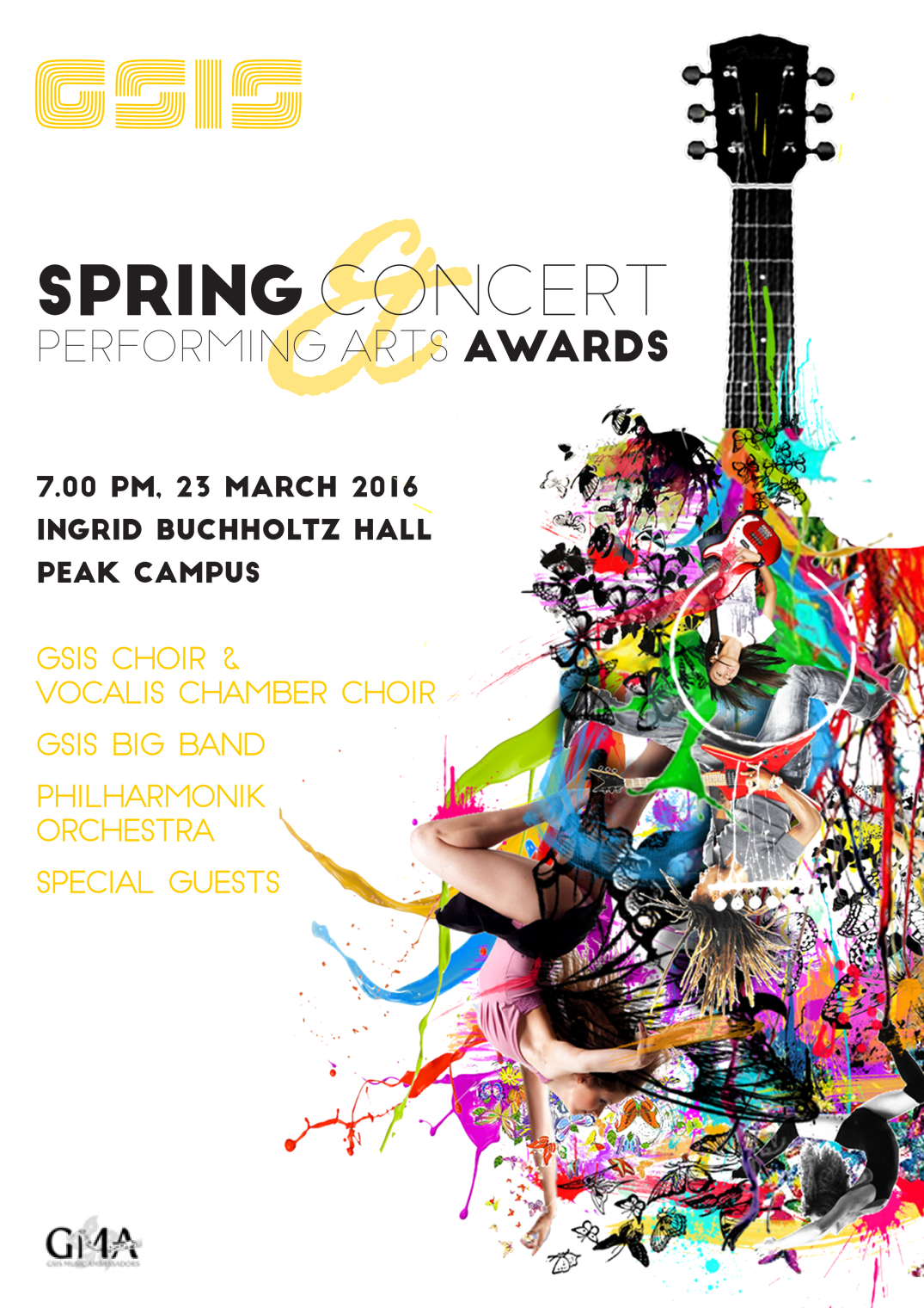
As a member of and PR officer for the GMA (GSIS Music Ambassadors), it is my honour to present you with the fruits of my torture: a number of posters for school events. Exciting! A disclaimer: though I do take credit for having done the bulk of work, I have a number of excellent mentors (cheers, school PR department!) and friends who gave me advice and suggestions as to how to improve the designs.
First, the drafts: my brief for the Christmas Gala Concert was something along the lines of “it should be impressive! Minimalist! Mature! Inspiring!” Hm. Baubles and aesthetic, here we come. For the Spring Concert, I was told to use a guitar graphic that has come to be used as a sort of second logo for the GMA.
The first was too minimalist, the second not minimalist enough (I sound like I’m complaining but really I’m not – making these posters is really fun! I’m getting closer to striking the balance first time. Someday…)
Though I’m in all honesty a novice when it comes to graphic design, I hope to learn and improve as best I can.
The last thing I did for the school robotics team before walking out the door was designing a logo. Our company is called RECCD, and well, there’s the design brief, right in the name. I hoped to to represent the electronics and mechanics involved (circuitboard-esque stylised wave, hexagon representing a nut), as well as the aspirations of the team to create a reliable ROV (remote operated vehicle). Perhaps I even succeeded!
IKEBANA – POPPIES, 2011, Acrylic on Canvas, 18×36”
ICY BEAUTY, 2011 Acrylic on Canvas, 40×30″
AMARYLLIS, 2006 Acrylic on Canvas, 24×36″
BOUGAINVILLEA, 2005 Arcylic on Canvas, 36×18″
I have always loved flowers for their beautiful colours, incredible variety and amazingly detailed shapes. How can something so tiny be so beautiful? Unfortunately, most of us won’t spend a lot of time looking at a particular flower. But, when you do, it seems as if an entirely new world opens up right in front of you. All that incredible detail that makes up those delicate shapes – the folds, the wrinkles, the translucency of the petals, the sometimes almost alien-like shapes of stigma, style and filament – isn’t that amazing?
Of course, I wasn’t the first one who painted flowers in a large scale to show off their hidden beauty. American artist Georgia O’Keeffe was decades ahead of me and justified her motivation to paint gigantic flowers as follows:
I decided that if I could paint that flower in a huge scale, you could not ignore its beauty.
After seeing her inspiring work, I no longer could.
I happened to have a pencil portrait phase some months ago… these two pieces probably represent the beginning of the development of my by now somewhat overly elaborate yet nonetheless preferred cross-hatched style.
My favourite subjects are elderly people (please no one be offended by this), because the natural wrinkles in their faces tell stories and bring out character in ways youth and supermodels with pristine features couldn’t possibly. And of course I added a self-indulgent detail shot. What did you expect?
For a whatever reasons, 90% of my year group was missing the Monday before the Christmas break. So, in order to get in gear for our upcoming annual migration to Africa, I used the unexpected free time to sketch some animals (you may recognise the subjects from some of my mother’s pictures. Oops. Do copyright laws apply inter-familially?)
These are a bit rough – the most I spent on any one of them was an hour, but they average out at about 30 minutes.
No one can tell me this isn’t art. Anything that takes this long must be art, it’s pretty much a law of nature. Hence, art. Also, vanity. (Though whether posting a picture in which I’m smiling so ridiculously counts as vanity or self-induced public humiliation can be debated.)
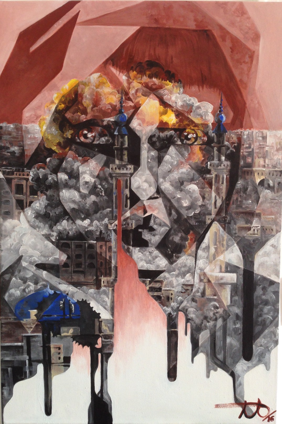
Ok so first off I’m going to tell you a bit about the painting itself. Technically this isn’t a piece that I would have made of my own volition, though planning and painting it turned out to be a lot of fun. Forgotten is a painting I did for my IGCSE art mock examinations, and was the outcome for my coursework topic “The Pen Is Mightier Than The Sword”. (The two might not seem obviously related, but I’ll explain everything in my sketchbook videos).
Forgotten is a tribute to those victims of war whose lives are torn apart, yet whose voices go unheard, whose faces go unphotographed; the thousands who suffer anonymously every day. To quickly draw an analogy to the original topic – their stories, carved and cratered by the destructive power of the sword, never have the chance to be healed or reconstructed by the constructive powers of the pen. There cannot be war without victims. Their stories overlay and are woven into the tapestry of conflict, of war, of the explosions and awful acts of terror that define it.
The drips were referenced from pictures of graffiti, again, again an integral part of modern war (the attempts of the pen to understand the sword’s chaos, and a bid by the anonymous victims to reclaim their lives by protesting the war which tore them apart).
The blank canvas beneath is just that – blank, open to interpretation. It could be the empty pages in memoirs that were never written, the empty futures of the victims, yawning like caverns beneath the immediate shock of war. Or perhaps, a futuristic city, a commentary on how war has shaped our civilisation, and the way we will never be able to wipe away the blood that smears the foundations of our skyscrapers. The inherently bloodthirsty nature of humanity. Your call.
… so yep, that’s the general idea behind Forgotten (:
So I discovered this grey paper that actually feels like it should be awful to draw on but isn’t… awesome. I made off with an entire stack and am industriously working my way through it.
The first was inspired by a cassowary documentary I had been watching (this is a show I definitely recommend to anyone interested in what lies beneath the skin of evolution… literally), but is otherwise drawn without a reference or any real purpose other than an excuse for not studying for my German oral exam.
Carnassial was done while listening to a series of lectures on the Hong Kong art scene (I swear drawing helps me focus), likewise without a reference. Doodles!
After brainstorming and gathering references for Bunte Träume, I found myself with a couple sketchbook pages’ worth of bunny sketches. Raring to try out our new scanner, I took it into Photoshop and coloured the doodles digitally. Happy Easter!
After, for as-yet unidentified reasons, I had neglected digital art for some months, I picked up my tablet again and started drawing… these are really my first forays into the world of Photoshop and its unblended deserts (ok I’ve since figured out how to make Photoshop blend but the sentiment’s there.)


")
")
")
")
")
")
")
")
")
 April 13 2006, 24x36inches, Acrylic on canvas")
")